Over the past three weeks I've had the privilege of witnessing some of my good friends complete their BFA senior show. After understanding the immense amount of work that went into preparing their final projects I thought it only natural to toot their horns for them a little bit here on my blog. All of the work in this post is that of my piers. Congrats to Willy, Laura, Janelle, Robin, Bill, Greg, Jed, Hunter and Brandy!
Oh and just a warning, this post will be abnormally long.
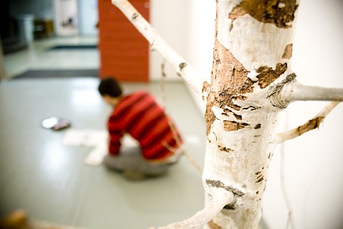
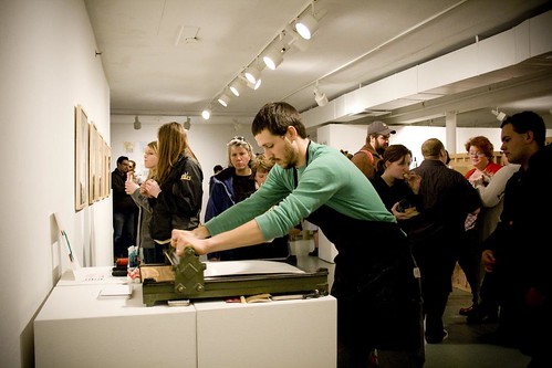
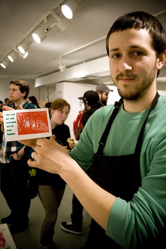
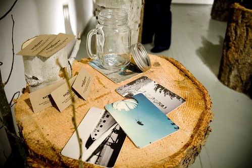
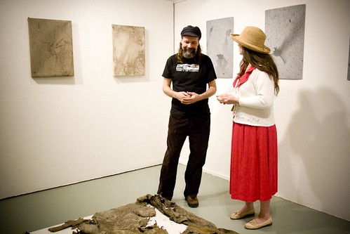
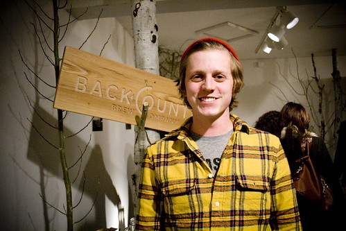
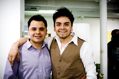
There were two separate BFA shows. Willy (above) and Laura (her tree pictured above) represented the first exhibition.
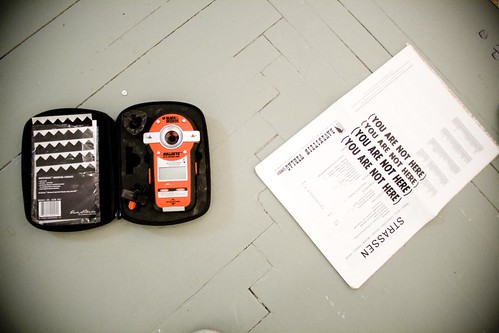
I was able to go in the night before the opening with Willy to help him set up and photograph some progress.
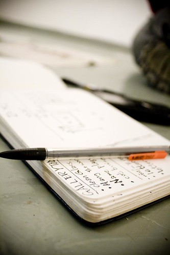
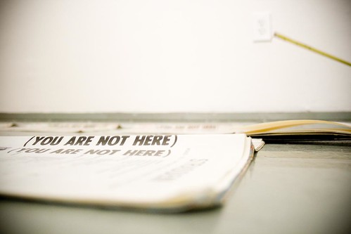
There was a lot of measuring to be done.
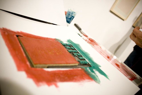
Willy's emphasis is in printmaking. For most of the works in his exhibit he used letterpress and stone lithography. More of his work can be viewed here.
During the show Willy did some proofs for passers by.
The set up worked out quite nicely.
Excellent job Willy.
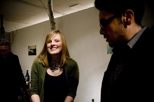
Next we have Laura: graphic designer and beer taster extraordinaire.
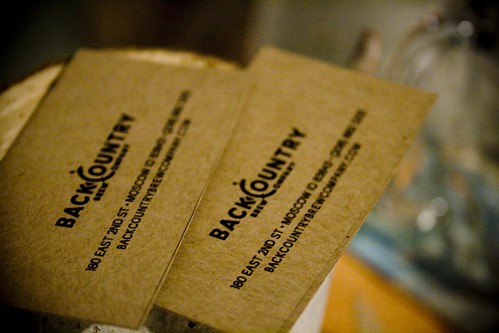
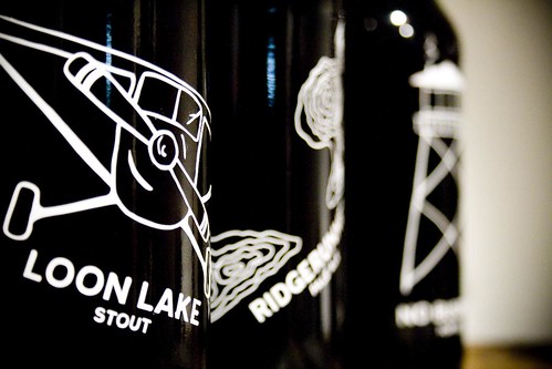
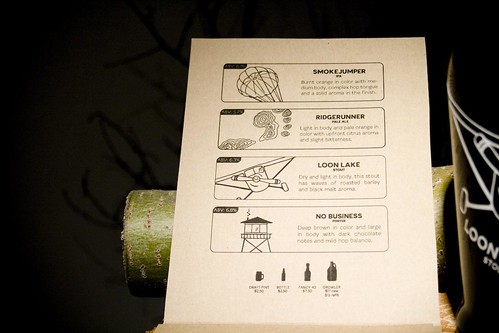
Her project was to design the packaging for an up and coming Northwest brewing company.
Her designs were executed flawlessly and displayed beautifully.
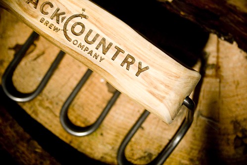
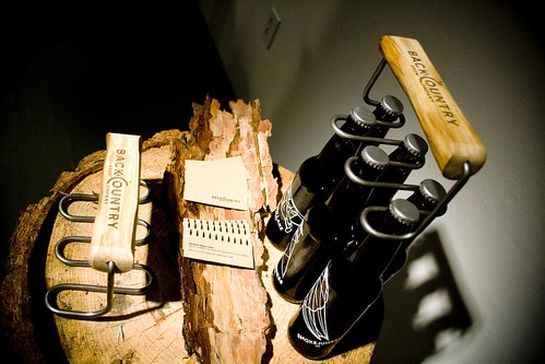
Her innovative mind was represented well with this fantastic bottle holder design.
I think that she effectively combined the use of wood and metal to keep a balanced and natural feel.
Nothing complements great graphic design like a good brew.
You can see more of Laura's work here.
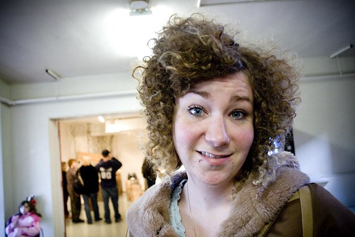
Claire (a U of I alum.) came to support. I always feel a little better when I see her new do. Aren't those curly locks amazing?
The following weekend was show number 2. There were many fantastic projects in this batch.
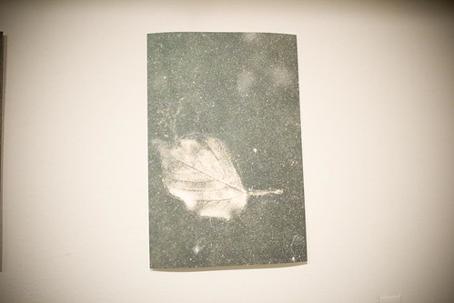
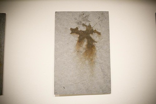
Take Greg's leaf in cement inspiration for one.
I love the color and texture.
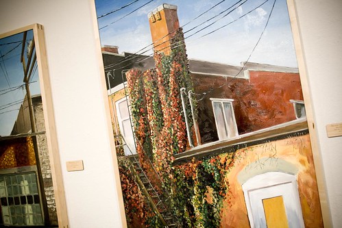
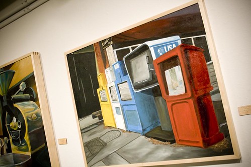
Jed sported some amazing paintings of local venues.
I very much enjoy the locations he chose as well as his excellent use of color.
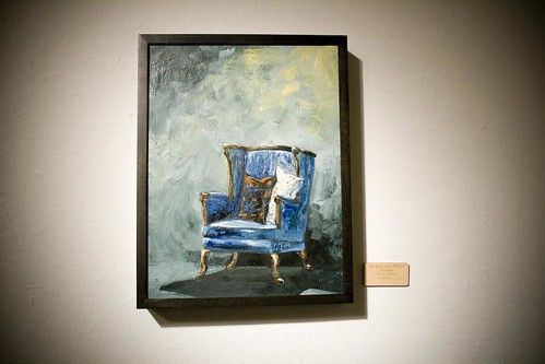
This little beauty was one of my faves.
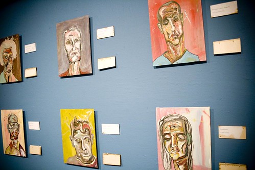
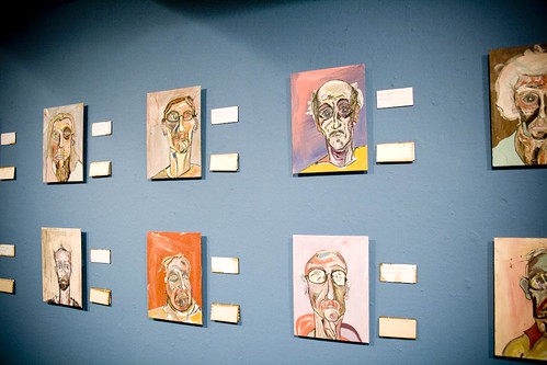
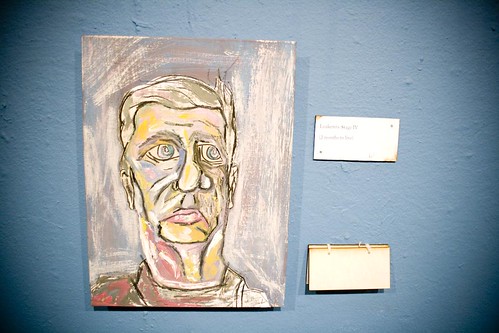
Bill also emphasized in painting.
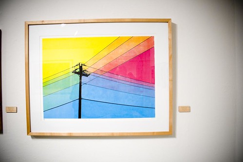
His series of images utilized an abstraction of color that encouraged the viewer to read the work's title.
Bill wanted to show the vulnerability of the viewer in relation to the history of the person in the painting. All of the people depicted in his paintings had mere months to live due to chronic disease. We tend to sympathize with those who are dying. However, the tables are turned when we flip to the second title of each piece that describes the sexual crimes of the dying person.
Thanks for making us think, Bill.
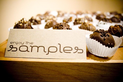
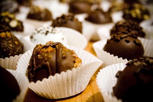
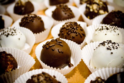
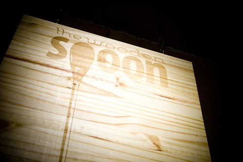
On a much sweeter note, Brandy did some branding for a candy business. I could be mistaken but I believe that she and her mom created all of the delicious edibles.
The peanut butter cup was incredible.
It's a good thing I'm not too hot on chocolate because these samples would not have lasted long.
Who doesn't love a good brittle?
And everything that wasn't edible still looked tasty.
Well thought out and nicely displayed!
Now we come to Robin ... or maybe we go to Robin.
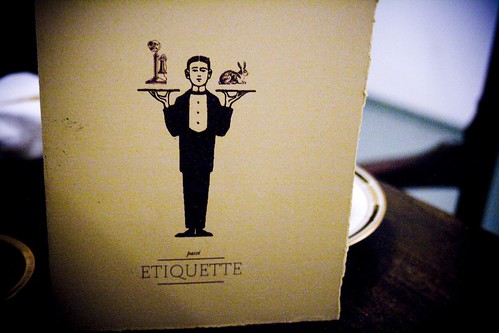
Weather or not we're coming or going Robin's vintage inspired design forces us to sit, relax, and enjoy the available for purchase atmosphere.
The high toned and fancy environment of his cafe allows us to feel pampered ... affordably.
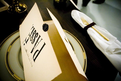
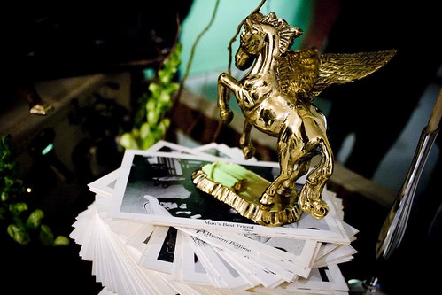
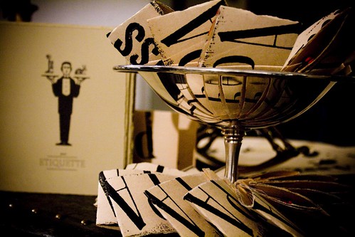
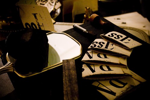
Robin combined his graphic design forces with the memorabilia of a local consignment shop to create a fresh and ever changing atmosphere to the cafe.
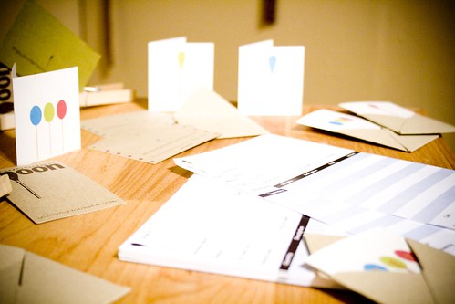
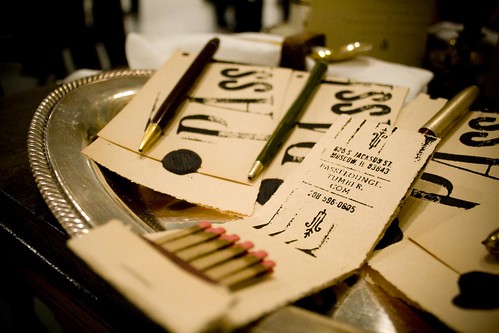
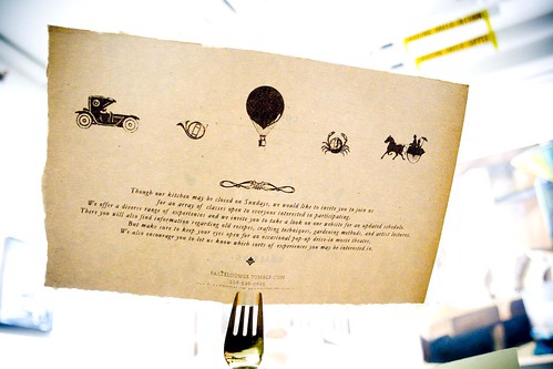
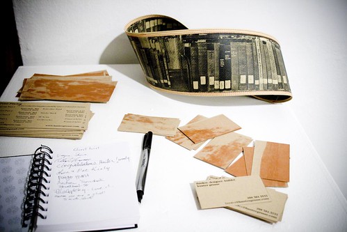
Robin did a combination of letterpress, screen printing and digital printing for the paper goods.
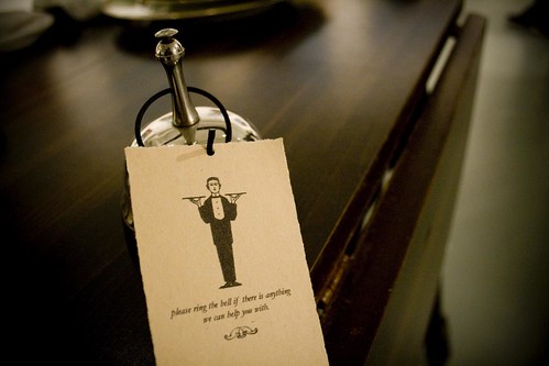
I've always wanted one of these little bells but, for the sanity of others it's probably good I've never had one.
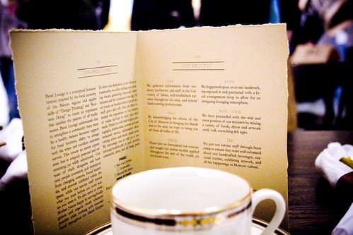
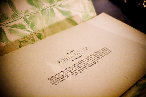
Sorry this is so small and difficult to read. You might have a better go at it if you click on the image and fly on over to my flickr page.
I thoroughly enjoyed his combination of accessories.
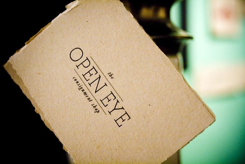
This is the name of the consignment shop located in Palouse, WA.
Take a matchbook with you to remind you of your enjoyable time.
Or incase your pilot light goes out.
Robin, you're such a creative kook and I love it.
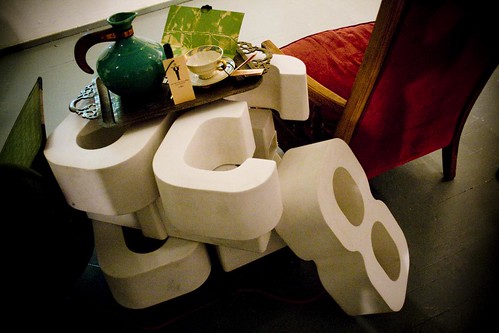
I really wanted to abscond with these giant numbers!
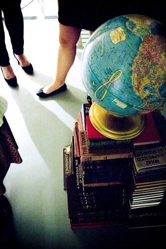
I would have sufficed for this collection of old books however.
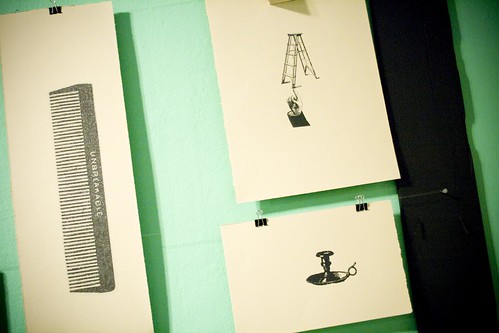
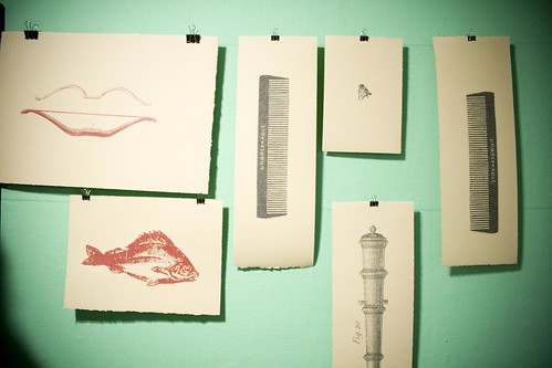
The brilliant green behind Robin's prints was delightful.
His prints were quite fun as well.
You can see more of Robin's stuff here.
Cheers to Robin and his most excellent vest.
Next we have Hunter the screen printer aficionado
Hunter did some breath taking 4 color separation screen prints. I envy his precision.
Well done Hunter.
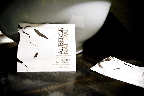
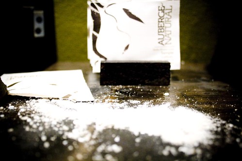
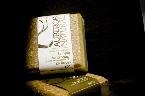
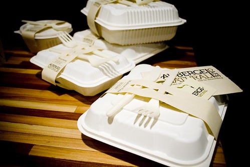
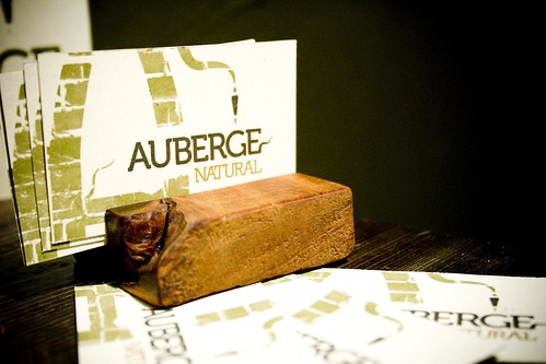
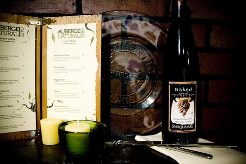
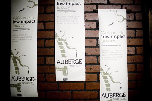
Finally we come to the last (but certainly not least) installment. Auberge, an eco-friendly hotel conceptualized and brought to life by my dear friend Janelle.
She defined even the smallest details.
And everything that could be purchased locally was.
She even made the beautiful multi tone wood table pictured above.
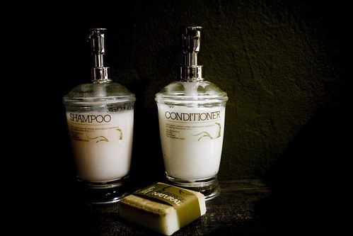
Just looking at this makes me want to wash my hair.
She played the wide range of natural colors and elements off each other very nicely.
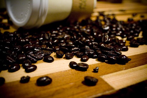
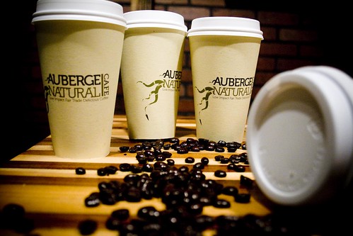
What is a Seattle based hotel without its coffee?
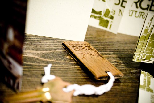
I'm usually pretty good about returning my hotel keys when I leave but this gorgeous key makes the choice a lot more difficult.
Exquisite.
This is a business card for a wallet, not just a pocket.
Don't forget your selection of local edibles.
You can see more of Janelle's work here.
A toast to all of the BFA seniors this year!

